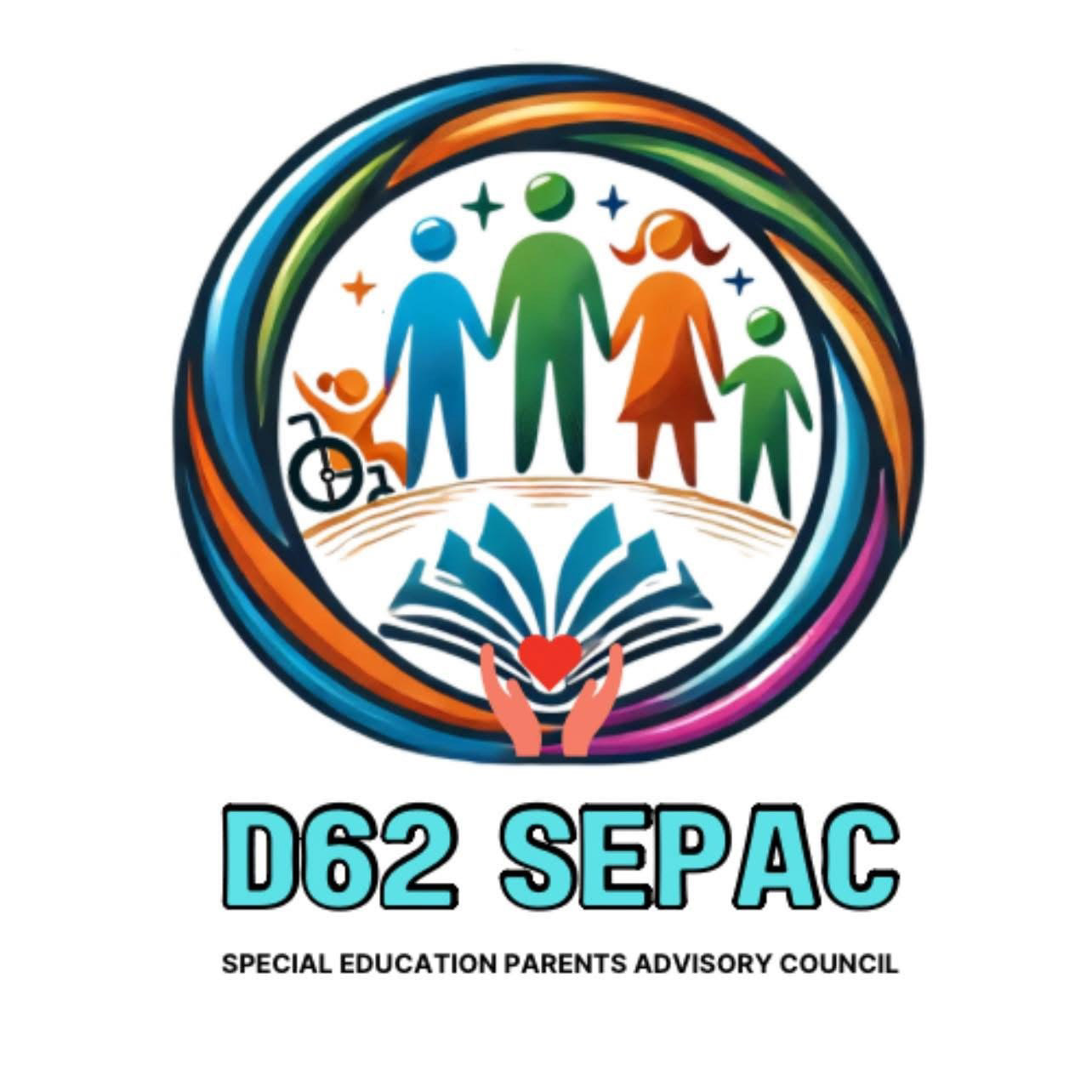
Developed a logo for the newly established District 62 Special Education Parent Advisory Council, a collaborative group of special education parents and district administrators dedicated to fostering inclusion, building community, and empowering parents as advocates for their children. The design was thoughtfully crafted to visually represent the council's mission, incorporating imagery that reflects diversity and inclusion. A key modification included the addition of a child in a wheelchair to ensure representation of individuals who are often underrepresented, reinforcing the group's commitment to accessibility and advocacy.
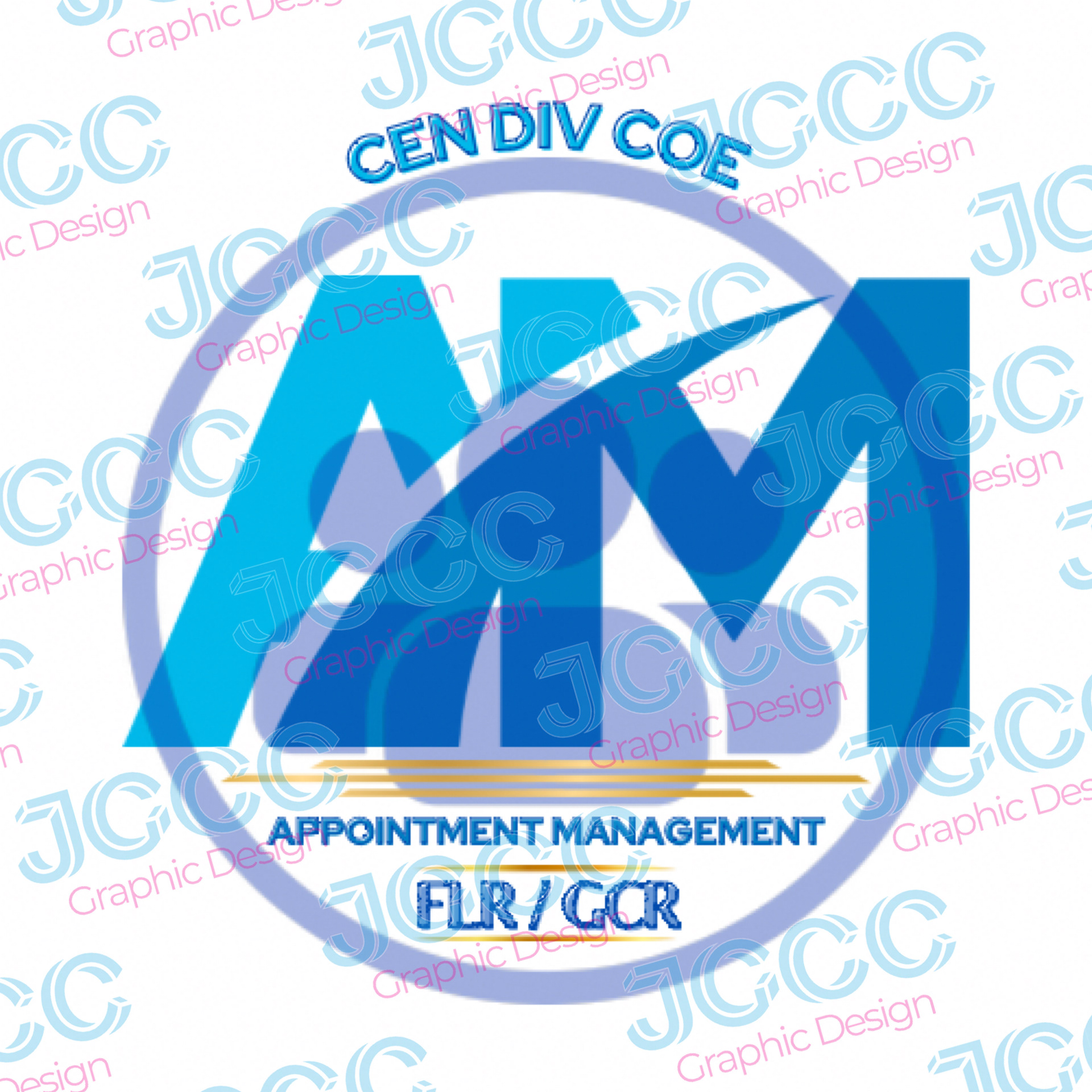
Department Logo
The client requested a logo that would represent their dispatch department and incorporate the name and location. This is an excellent demonstration of visual hierarchy achieved through typography and imagery. The imagery chosen is eye-catching and will attract the audience's attention, while the text is designed to be easily legible and readable.
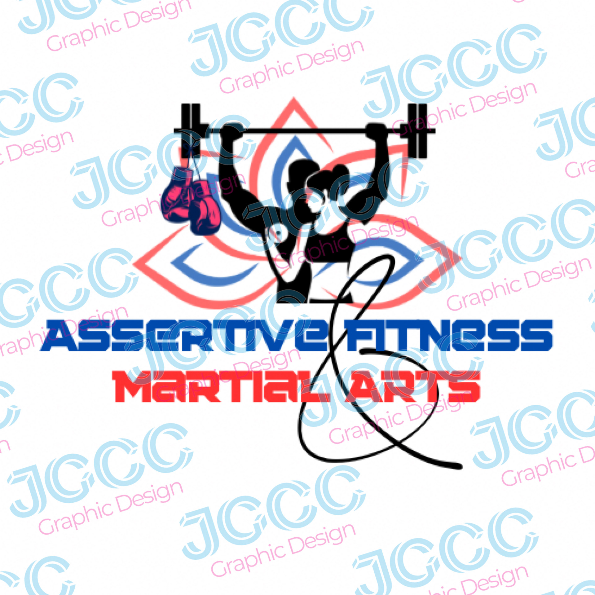
Fitness/Gym Logo
The client is passionate about fitness, particularly Muay Thai, but wanted a logo that could attract a diverse range of fitness enthusiasts and clients. To add a personal touch and promote the martial arts classes available, a lotus graphic was incorporated in the background.

Realtor Logo
The client requested a professional-looking logo with home imagery and cursive font. Cursive font can be hard to read at times, so I made sure to use an elegant and readable font.
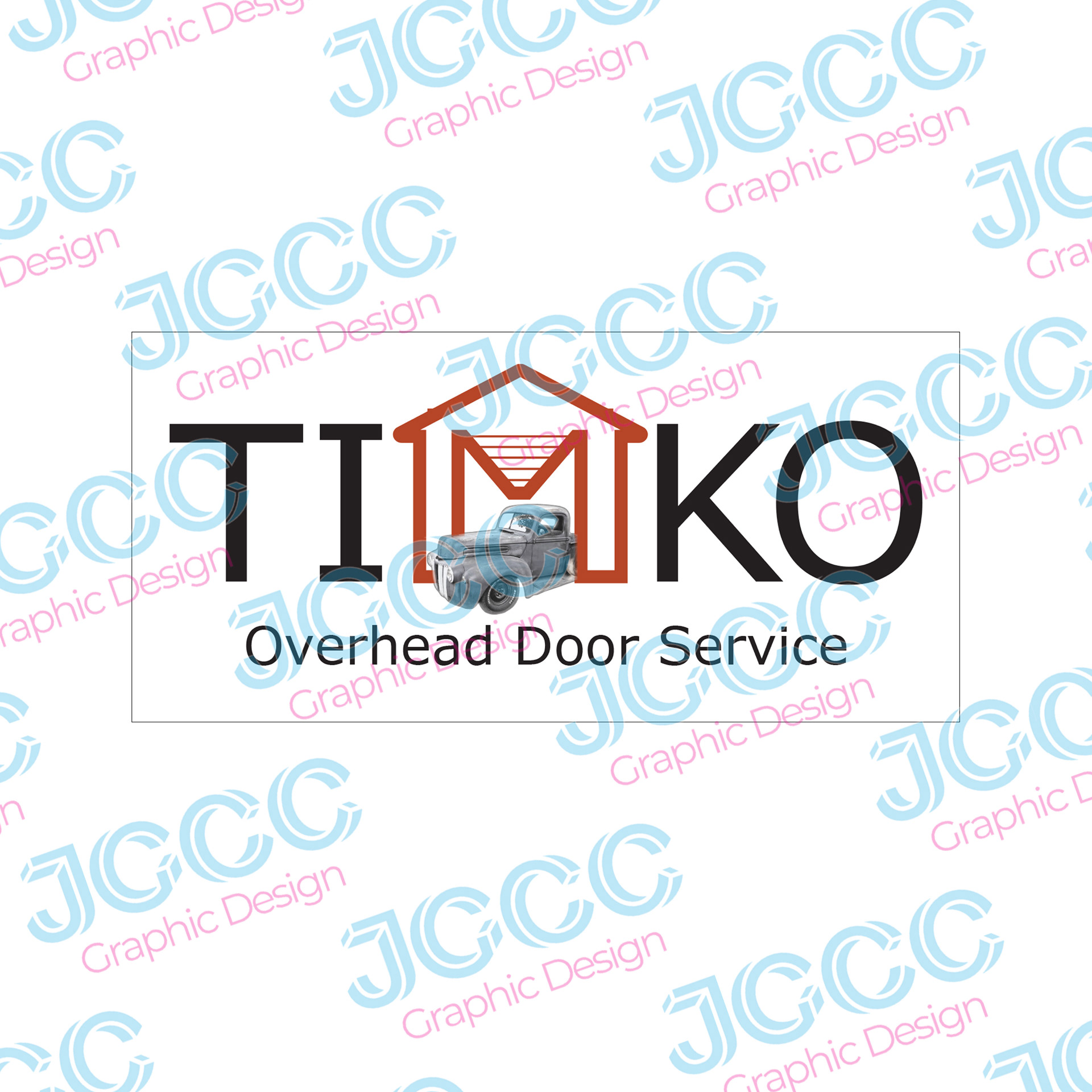
Overhead Door Services
The client asked for a logo design that included an image of his vintage pickup truck. I was able to cleverly incorporate the truck by modifying the M in his name to resemble a garage door. I also used a bright orange color to ensure that the focus remains on the overhead door service.